Step 1: Display Grid
First, we change the display to be “grid”:
Step 2: Define Grid
We then define the grid using “fr” (short for fraction) as the following:
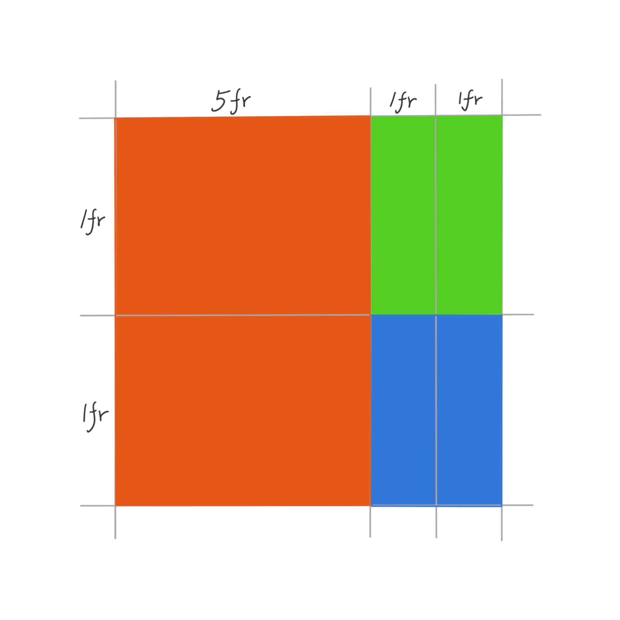
Think of each fraction as 1 unit. So the above code defines a grid with 3 columns with width 5, 1, 1 respectively and two rows with equal height. One can also define the grid using px, percentages and other units, but I find “fr” to be very convenient.
Step 3: Place Content Into the Grid
The easiest way is to use grid-template-areas:
div.container {
    display: grid;
    grid-template-columns: 5fr 1fr 1fr;
    grid-template-rows: 1fr 1fr;
    grid-template-areas:
        "description social rss"
        "description social rss";
}

div.description {
    grid-area: description;
    justify-self: stretch;
    align-self: stretch;
}
div.social {
    grid-area: social;
    justify-self: stretch;
    align-self: stretch;
}
div.rss {
    grid-area: rss;
    justify-self: stretch;
    align-self: stretch;
}
We assign the grid-area attribute for each block that we want to place into the grid, and then use grid-template-areas to easily specify how they should be layed out within the grid. The justify-self and align-self attributes further specifies how they should be justified and aligned within their grid space.
That should get you started! It’s really that simple!
For more features and details about css grid, you can look up this wonderful guide: A Complete Guide to Grid.